I had the honor of getting to judge a recent international wedding photography contest for Fearless Photographers, a great organization I’ve been a part of for the last few years. Fearless contests run several times a year and typically receive thousands (if not tens of thousands) of entries from around the world. There is no quota to meet for Fearless judges, so if an image is awesome, it gets an award. The judging is incredibly selective, and seems to get more selective with each round.
Before going any further, I want to point out in bold letters that I did not shoot ANY of the images in this post. Since I was a judge, I wasn’t allowed to enter my own work. The photos below are some of the award winners we selected, and I’m using them to illustrate some musings about wedding photography in general.
THESE ARE NOT MY IMAGES.
THEY ARE FROM OTHER PHOTOGRAPHERS.
VISIT THEIR SITES AND GET INSPIRED.
I try to do a lot more with my own wedding photography in Colorado than just “capture the day.” It’s more like I’m trying to capture 30 years. I try to tell the history of a brand new family, using a wedding — the guests, families, laughs, tears, fears, artfulness, anticipation, chaos, weather, and every other element there — as the vehicle to do it. Thankfully I get to do it in some of Colorado’s most beautiful towns, like Aspen, Vail and Estes Park.
Anyway, wedding photography in this way is a tremendous challenge that I think a lot of Fearless Photographers would identify with. Despite booking weddings for my 10th full time season, I am still trying to bring my own work to another level. The moment I stop trying to improve is the moment I put down the camera and go do something else. So, let’s all raise a glass: onward and upward.
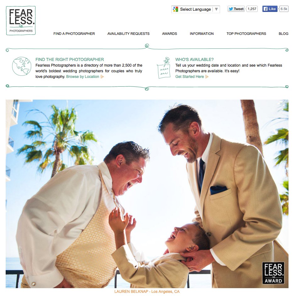
Below is what the Fearless site looks like. If you’re a bride, it’s a wonderful resource because you can post job ads and (hopefully) find a great photographer for your big day. Responses are sorted by who’s closest to you, and who has won the most awards in recent contests.
Fearless photos are damn inspirational. They’re completely different than the washed out, pastel, utterly forgettable detail shots of bouquets drowning out the majority of wedding industry blogs. They tend to make me stop and stare. They are arresting. I can’t remember anything about that desaturated pink flower shot I saw on the InstaTweetMyFaceGrams yesterday, but I vividly remember some of the images that show up in the award galleries. They’re iconic.
If you’re a photographer, skim through this and take some of the points to heart should you enter contests in the future, either for Fearless, or for the Wedding Photojournalist Association, the International Society of Professional Wedding Photographers, or some other photography organization. I know I will re-read this before I enter my work.
Our small team from the Colorado Wedding Photojournalist Association selected 149 images, while another team selected a few different images, and the final tally of award winners topped out around 250. I’m not sure the total that were entered but I think it’s safe to say we awarded somewhere between 1% and 5% of the total images entered from photographers worldwide. Winning a Fearless award is actually a really big deal.
Judging the round was very, very illuminating for me. I began to imagine what it might feel like for a bride looking at portfolios around the web. I was deluged with so many photographs, many of them quite good. But after a while, cliches became more cliche, odd compositions became awkward, and funky editing quickly became overwhelming. It began to be a lot easier than I expected to see the difference between good and great, because images started to really pop out after a while. Even if one may not have the vocabulary to describe the differences between good and great, she or he can certainly feel those differences.
I thought it might be interesting to write notes down, so I did, partly for myself, and partly for other photographers thinking about entering future rounds. Julian Wainright wrote about his experience judging Collection 17 (http://www.fearlessmembers.com/read-this-before-your-enter-photos/), and some of what he said is exactly what I wrote down while I was judging. A lot of images in the contest seemed to have come from people who didn’t fully digest the importance of his post, so I’m going reiterate some of what he said, and add some new thoughts as well.
I know I didn’t pay that much attention to his words until I judged a round myself.
Photography is incredibly subjective, which is one reason it’s so much fun, so moving, and so incredibly powerful. Some of the strongest images I saw broke a number of the “rules” I’ve listed below, but I truly believe the points I mention do set a basis for better photography. I fail to follow them all the time, but I am always trying to follow them more often.
All this said, there is still a lot of mystery involved in being successful in wedding photography contests. To this day don’t understand why some of my entries won awards over the years and others have not, despite re-entering those “failed” shots again and again. I think success has to do with the image itself, what side of the bed the judges woke up on, the weather, and some black magic. Or, perhaps I need to stop making excuses and re-read my list and Julian’s post a few more times.
Here are some of my notes, presented in no particular order, and illustrated by some of incredible award winners we chose.
1- Static Subjects. Often, in wedding photography, we are faced with static subjects. There is not a lot of peak action in an embrace, or a kiss, or a furtive glance. What there absolutely can be, however, is tension. In other words, you can have motion, and a LOT of it, in an image where nothing is moving. It’s emotional motion.
Here’s what I mean:

Great shot, right? Big congrats to Tina Wright, a photographer in Arizona, for this capture. Visit her site here.
I like that shot because nothing is moving in this frame, but there is a lot of tension. Something just happened, something is happening, and something is about to happen. It’s easy to see a story arc — a beginning, middle, and, if you use some imagination, an end. It is all contained in a very simple, perfectly executed image.
Tina’s shot reminds me of another one of my favorite images that I came across in the contest: a very simple, tight shot of the side of a man’s face. He had a lipstick mark on his cheek, and in the right side of the frame was a seductive, suggestive pair of red lips and a nose. There was no dancing, no jumping dogs, no running bridal party. Most likely the face on the right of the frame wasn’t even moving. But the whole thing told a great story.
With lack of motion must come emotion and tension. Amazing photography often evokes a sense of action or connection even if the subject matter is static.
Another stand-out photograph that illustrates this is from Erin Chrisman. Visit her site only if you have half an hour to spare, because you’ll likely be stuck there for a while. Her shot struck me because there is so much going on here, yet the scene is relatively static.
My eyes snap into focus on the bright rails in front of the (apparent) groom, because we tend to focus on bright spots in images. I follow those rails straight down to the bride’s face, and I notice the rail coming in front the right edge of the frame telling me that yes, I am looking at the right place.

What’s important to me is the look on her face — she is glancing over her shoulder at her groom in a very mysterious way, almost beckoning him. It’s pretty damn sexy, and her expression redirects me back up to the groom. After staring at him for a second, I sort of “release” my concentration and glance around the frame. Even the silhouettes on the bottom left seem pretty engaged. There is so little action here, but there’s a lot of information guiding me around the shot, and as I look at it, I can’t help but concoct some great story about what’s going on. There is a lot of tension and motion in this shot, and I love that everyone is connected somehow to everyone else.
2 – Cliches. Don’t do what everyone else is doing just because they’re doing it. To the eyes of a judge (be it a contest judge or a potential client), cliches get old and stale. This includes, but is not limited to, dips, overuse of sun flare, backlighting your subjects with a flash in a rain storm, finding romantic words in a book and putting a ring on top, etc. If something has been seen too many times, your work will vanish into the ether unless it is somehow 1000 times better than the last iteration, which is almost never. We saw a lot of images of rings on fire, but maybe awarded one.
Bottom line: We can’t make a unique first impression if we’re the second (or 1000th) person to do so.
Whenever I think I’ve made a great image, I try to take a step back, evaluate what is trendy, and truly rethink why I’m shooting what I’m shooting.
A wedding day as it unfolds is way more interesting than re-creating something that already happened or that you saw somewhere else, so keep your eyes opened for the real stuff. Life is stranger and a lot more compelling than fiction.
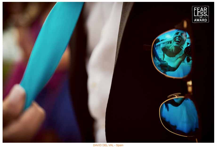
3 – Background Subject Placement. Similarly, avoid placing small human forms in random corners of the frame just because everyone else is doing it. If you’re going to do it, do it for a reason.
These sorts of images have become popular over the last few years, and with few exception, they were not executed well enough to win an award in our judging. No amount of epic light or color or technical proficiency can trump the fact that the couple must be engaged with each other, or a story must be unfolding. The majority of these images showed small silhouettes without any apparent connection or emotional arc.
Couples facing each other, holding hands, and touching foreheads rarely has the romance, tension or moment to move an image into the category of award-winner. Refer back to point 1 if you want to bring this type of image from okay to outstanding.
One thing I like about Erin Chrisman’s shot above is that every face in the scene is engaged in what’s going on, and the couple is engaged in each other.
Here is a great example of how to perfectly execute one of these “small human form” images, from Spain’s insanely talented David Del Val. (Visit his site here). This is a great find, a great detail, a great moment, and a great way to put the subject small in the frame. This bride looks to be pulling her husband’s tie so she can get a kiss. There’s a whole story, and a definite sense of connection in this shot, even though the bride’s face is hidden away in the reflection on some glasses.
4 – Foreground Subject Placement. A corollary to Point 3 is “Don’t Put Stuff In Foreground Just To Put Stuff in Foreground.” I am guilty of this, as well as every other point on this list, myself. How many of us have deliberately shot through chandeliers, table candles, stained glass windows, cracks in door frames, or any of the multitude of colorful or shapely objects we might find laying around, just to do something different? Probably a lot of us, and we justify it by calling it “framing.” Many “Stuff in the Foreground” images lacked emotion, tension or action, yet were colorful because there happened to be a set of blurry Christmas lights in the foreground.
As photographers, we often too easily get distracted by what looks cool and forget about the story we’re trying to tell. If we are shooting through a stained glass window, for example, what we should be doing is noticing the colors of that window and how they help to create contrast in the image, and therefore how they help to create leading lines that play on our emotions and direct our eyes around the frame — and, most importantly, direct our eyes to a subject that exhibits strong moment, action and/or tension. This is the difference between one that made our judging team go “Cool, but let’s see the next one” and one that absolutely arrested us, made us stare for a minute or two, and sparked discussion.
These “holy crap” images are what gets us hired. Try to create more of them, with intention.
5 – Faces in the crowd. I can’t tell you how many images I rejected because people in frame were there in body but not spirit. If guests have their faces in their phones, move somewhere else and take them out of the image. An engaging photo cannot have disengaged faces. It’s a total fail. I was adamant about this from my judging seat.
Mexican photographer Adan Diaz pretty much nailed it with this photo below, where almost every single face in that crowd is lit up and animated. I spent a few minutes studying each facial expression. It’s super hard to get 10 people in a group shot to all look at the camera at the same time, but Adan managed to capture 60 to 70 people all cheering on the bride and groom. I don’t know if it was staged or not, but I loved this image. It is awesome work. Be sure to visit Adan’s site!

There are a lot of pretty hilarious party shots that came through in the latest round, but one thing I noticed is that a lot of the time, many of the faces in the crowd weren’t paying attention to the key moment. This may not kill an image entirely — sure, it still may be a portfolio image — but it will certainly hamper its chances of winning an award.
A great photograph is not a blurry background and an isolated foreground (for more, refer to Point 14 — Nokeh). Great photography often uses depth and layers to guide our eyes around a frame, allowing us to absorb lots of information and, as a result, a complete story. Those details and faces in the background are important because they give us context and connection.
6 – Cropping. I saw way too many images that suffered from lazy in-camera compositions, where I’d see something like a bride on the left, the groom centered in the frame, and the right third of the frame had empty space. Certainly some cameras have limitations — the original 5d was, at least for me, a center point only camera — but if you’re working with this kind of camera and don’t have time to focus and recompose due to a moving subject, crop out that empty space in post unless it adds to the shot.
Things that help an image are other engaged people, random body parts that are extremely expressive (yes, it helps), leading lines, or other compositional elements that add tension or a sense of place or direct us somewhere important. Things that do not are fire extinguishers, body parts that are not expressive, body parts that obscure engaged people, strange lines that direct the eye away from the subject.
Also, if part of the frame doesn’t add to the image or help tell a story, crop it out. If you leave it in, it will distract your viewers and make the shot less powerful.
7 – Toning. I saw a lot of shots where skin tones were orange or black hair was blue. Use the HSL sliders in Lightroom to tweak the hues or desaturate these colors, or do selective brushing to fix the problems. I immediately rejected all images like this, no matter how good the moments were.
8 – Vignetting. I also saw too many images with indiscriminate use of vignetting presets — often they looked overdone, artificial, and obscured important elements within the image (see Point 5 — some great shots were so vignetted that the engaged faces literally disappeared into the shadows). Go easy on the vignettes.
9 – Be More Than Different. I saw a lot of images where the photographer had selected images that were different for the sake of being different. Unfortunately, these images were not better for it. Examples: shot underwater; bride was wearing strange shoes; groom had odd glasses; there was a helicopter in the background; a guy had gigantic eyes; the couple was the same sex. In all cases, if the element that kept the shot from being “status quo” was switched to something that we see more often, the shot still wouldn’t have been interesting. In a way, I was a little bummed about seeing some of these shots. There is a fine line between making fun of a subject, and shooting a subject that’s funny. I felt like too often there’s a gravitation toward funny looking instead of funny.
10 – Camera Tilt. Camera tilt does not add dynamism to an image. Most of the time, it makes you wonder if the photographer was under the influence. Use it sparingly, or with purpose.
11 – Epic needs to be more epic. Epic shots of the bride and groom need to be insanely epic. As Julian wrote, “Dull moments in a beautiful locale are still dull.” Refer to Point 1 above — couples need to be engaged and connected, or else an image will fall flat. People can say a lot with their bodies. We as photographers need to allow, encourage, or help them to do so. I thought there were a lot of opportunities for improvement in this category of images.
12 – Go Big. Big expressions win. Over the top big wins. Reason? Over the top is almost impossible to fake, and when you see something outrageous, chances are it was a real moment, with a real story behind it, and it gets the viewer intrigued.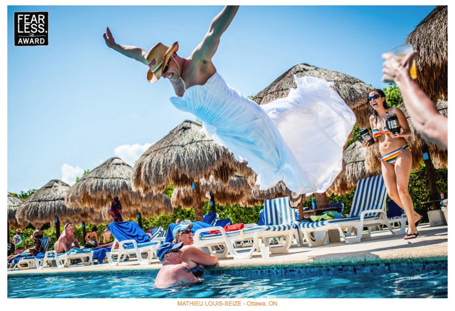
I know I am pretty damn intrigued by the above shot the talented Mathieu Louis-Seize at Green Tea Photography based out of Ottawa. Visit his site — it’s great! This award-winner is outrageous, and Mathieu tells me that the guy in the dress is actually the groom, with his bride is the one in the bikini, double fisting two huge insulated beer mugs. Bottom line: go big or go home.
13 – Be Dead Sexy. I am a sucker for sexy, and all my judging colleagues thought I was super weird every time a sexy image came up. I’d yell, “That’s sexy!” But I wasn’t being a perv about it — I just love images that are evocative and get me wondering. I’m a curious type, and I think most people are as well. Humans, by nature, try to explain the unknown. Good photography can play on that urge.
The above image was a contest winner from Russian photographer Konstantin Eremeev (portfolio here — visit it now!).
So, yes. When I saw this shot, I jumped out of my seat and yelled “That’s sexy!”
It’s super simple, but there is a lot going on here that tells a story. This is obviously an engagement session, and I’m going to assume the couple absolutely adores this shot. They’re probably someplace they love, the sun is setting, the colors are great, the wind’s raging, the hair and jaw lines all draw my eyes right to their lips, which are not obscured. However, their eyes are covered up by hair, which mean’s something’s missing, which means I start to wonder. There’s just enough missing information to get me thinking, and I start to imagine what they were feeling. Their connection in this image is absolutely palpable. One of the trickiest things about wedding photography is allowing people to connect when they’re in front of a camera. It’s not easy to do, and Konstantin managed to do it super well.
The below image was a contest winner from French photographer Dan Petrovic. Don’t be shy — go and click over to his site and poke around.

This image was one of my favorites of the competition, and I liked it for many of the same reasons I was drawn to the image by Konstantin. I thought there was great body language and a huge sense of connection between the couple. Once again, the frame left out just enough information to get me thinking. I also love that he was able to bring in a great sense of place, and the lighting, toning and ambience only added to the feel of the image.
Note that the couple doesn’t just have their heads together, or their foreheads touching. There is more to it than that — they are almost kissing, which give the image tension and a story arc. I also like that the balloons aren’t floating straight up, which despite the static nature of the frame yields a sense of motion.
14 – Anticipate Moments and Include Expressive Body Parts
Wedding photography is my full time job, but I dabble in adventure and climbing photography in the off season. It’s a fun hobby that keeps me psyched, refreshes my eye, and presents its own set of challenges that actually translate perfectly into weddings. One of the best skills to hone as a wedding photographer is anticipation, which gets highly developed when you’re shooting athletes hanging from cliff faces. I need to be in tune with those athletes, and I need to sense how they feel, what they’re thinking, and what they’re about to do. What hold are they going to next? Are they about to fall?
I try really hard to have that same sense of connection with my wedding clients, because I think it’s critical to envision the important wedding moments before they actually happen. If I don’t see something coming, I wind up reacting to it. If I see it coming, I document it. This is an enormous difference. If you’re not tuned in to the bride, groom, or their friends and family, you wind up shooting from the hip, and compositions suffer a lot.
I find that body language can be as expressive or even more expressive than faces. Probably the single most expressive body part, aside from the face, is the human hand. Unsurprisingly, it’s the only body part besides the mouth that can actually “talk.”
Whenever I see someone’s hand cut off in the frame — both in climbing and wedding photography — I get a bad feeling. To me, it’s almost as taboo as cutting someone’s face in half, and it’s an indication that the photographer was reacting to a moment instead of anticipating it. I voted away a lot of images with important body parts cropped out of the frame.
15 – Watch The Lines. There were a lot of decent photos that could have been made a lot better if the photographer had paid more attention to the lines in the horizon or backgrounds. Too often, those lines bisected peoples heads, which caused major distraction. Denver photographer Trent Gillespie (whose site you have to visit here) perfectly illustrated how to do this right with the below shot. He was either lined up in the perfect place, or he backed up or kneeled down, to keep the bride’s head from being bisected by the line of the water meeting the island. He wasn’t reacting to a moment, but anticipating a moment and figuring out how to maximize it.
I liked this shot personally, and I liked it more because it reminded me of Ton Sai beach in Thailand, where I’ve spent a significant amount of time teaching diving and rock climbing over the years.

16 – NoKeh. Every winter, during the wedding off-season, I challenge myself to shoot a little differently: use a lens I’m not comfortable with more often; use a fiddly camera like my EOS M more often, so I consider my compositions more carefully; shoot with my iPhone and try to create something awesome; stop using flashes as much; etc.
Perhaps the most beneficial challenge I made to myself during my whole career was to shoot all non-wedding images between f/8 and f/16 for six months straight. I can’t tell you how much better this made my eye. I’m not suggesting that people shoot a wedding at f/8 or f/16 — I most certainly don’t — but I am suggesting that photography in general would be a whole lot better if we stopped opening up our lenses for every.single.shutter.click. Relying on wide open glass breeds laziness.
Check out this lovely image by the Brazilian photographer Gustavo Vanassi, and be sure to visit his website here. This image is a perfect example of what I’m talking about — Gustavo was thinking and being intentional, and wanted the entire frame to be relatively sharp. I bet he shot this between f/16 and f/22. In doing so, he made an image with a perfect sense of place.

My “No Bokeh Challenge” taught me to better see the scene for what it is, identify distracting elements, and learn how to maximize layers. There is a lot of mediocre photography that’s shot wide open with a 50mm, with good subject detail and a lot of colorful mush in the foreground and background. Sometimes this can be beautiful, but it’s also often simply boring. At its core, it’s still just a bunch of colorful mush.
I’d suggest checking out this great F Stoppers article: https://fstoppers.com/architecture/ultimate-guide-composition-part-one-just-say-nokeh-31359.
Then, when you’re done, read this one: https://fstoppers.com/education/ultimate-guide-composition-part-two-beyond-basics-32902.
If you practice stopping down for a while, you can bring a better vision into your images. You can tell a story better. You can use this vision even when you’re operating at f/1.2 or f/1.4.
While I’m on a rant, I’ll actually go a step further here. I’ll probably wind up with a bunch of hate mail, but I am going to suggest that photographers are doing their clients a disservice by shooting wide open all the time. I drop down below f/2 at every wedding I shoot — of course — but only when I need to or am trying to do something deliberate. The technical deficiencies that most prime lenses exhibit at f/1.2 and f/1.4 are, in my opinion, undeliverable too much of the time.
And yes, that means the 85mm f/1.2L Mark II, the 50mm f/1.2L, the 24mm f/1.4L Mark II, and so forth. They’re too soft too often when shot wide open. Each lens and body of mine is calibrated using FoCal, a great piece of software that every working pro should consider investing in. The copies I own are super sharp. They’re just obscenely sharp when stopped down a little bit, and I get more detail in the frame with which to tell a story.
Anyway, I really suggest you pop over to the Fearless site and check out the round. We were all really proud of the final collection. Congratulations to all the winners — your work is strong and very, very, very inspiring.
I also want to note that Fearless awards are truly merit based. A jury of peers judges each round, it’s blinded, and nobody has anything to gain except the contestants themselves. In fact, membership dues each year cover a set number of entries into each contest.
And last, for brides still reading this: be aware that the vast majority of awards floating around in the wedding industry are absolute nonsense. In general, pay attention to awards that come from photography organizations like Fearless, the ISPWP, and the WPJA, and completely ignore the ones that come from local papers, television stations, wedding vendor directories that are not specific to photography, companies selling products, and online review sites. The first set — those awarded by photo organizations — are judged by a blinded jury. The latter set is generally a marketing effort by a website to get photographers to do free advertising for them: We give you an award, and you blog about it, and then link back to us, thereby driving traffic our way so we can sell something. I have lots of ethical issues with this, but that’s for another day.
If you enjoyed this article, please leave a comment and link to it from somewhere. It’s my hope that it will elevate, at least in some tiny, minute way, the quality of wedding photography somewhere.
Thanks for sharing! As an aspiring Fearless Photographer. I feel to become one, I need to think like one. Thank you for your invaluable insight.
Thank you for the information. I love to read about how Fearless is judged and how a judge sees certain things. A great way to help me get better. Thank you!!!
This was a great read, thank you.
Great information and wonderful winning images! So inspiring.
very detailed and aptly pointed out a lot of nuances.
Super article – thanks for sharing
Nice points Thank you for sharing 🙂
An awesome read with many points to consider! Thank you! 🙂
thanks for sharing these insights. some great work and amazing variety. I keep coming back to points that resonate with me and am always improving
wow great post 🙂
Thanks man. This was a tough read (in a good way) as it’s forced me to look at why maybe the images I like so much in my portfolio need more work in order to stand a chance being head and shoulders with the competition.
Thank you so much for sharing this amazing article with us, I will be taking all your comments on board! For those thinking you need the location and the beautiful couple to win a fearless award… that’s not the case for me who works in the same boring hotels in small towns in Scotland with nothing remotely beautiful surrounding them and I am very proud and ecstatic to have won an award in the recent collection 23. Thank you!
You go Natalie!
A good photographer will make due with what they have. An eye is a valuable thing.
Way to go, Natalie! I love so many Fearless images and once made a list of characteristics I saw among the winners. Just posted it in the comments, and it was insightful because so many of the winners don’t rely on the exotic.
Great post, with great tips. Thanks. 🙂
Love Lauren Belknap’s work!
Thank you! Great article, almost workshop :-).